Dashboard
Forkast: Bringing insights first in data and dashboards for an AI-enabled startup trusted by 550+ restaurant chains, from the Michelin-starred to Red Robin
roles
Product Designer
UX Researcher
tools
Figma
Claude Design
Claude Code
team
Me
overview
Bringing clarity through constraints to B2B market data.
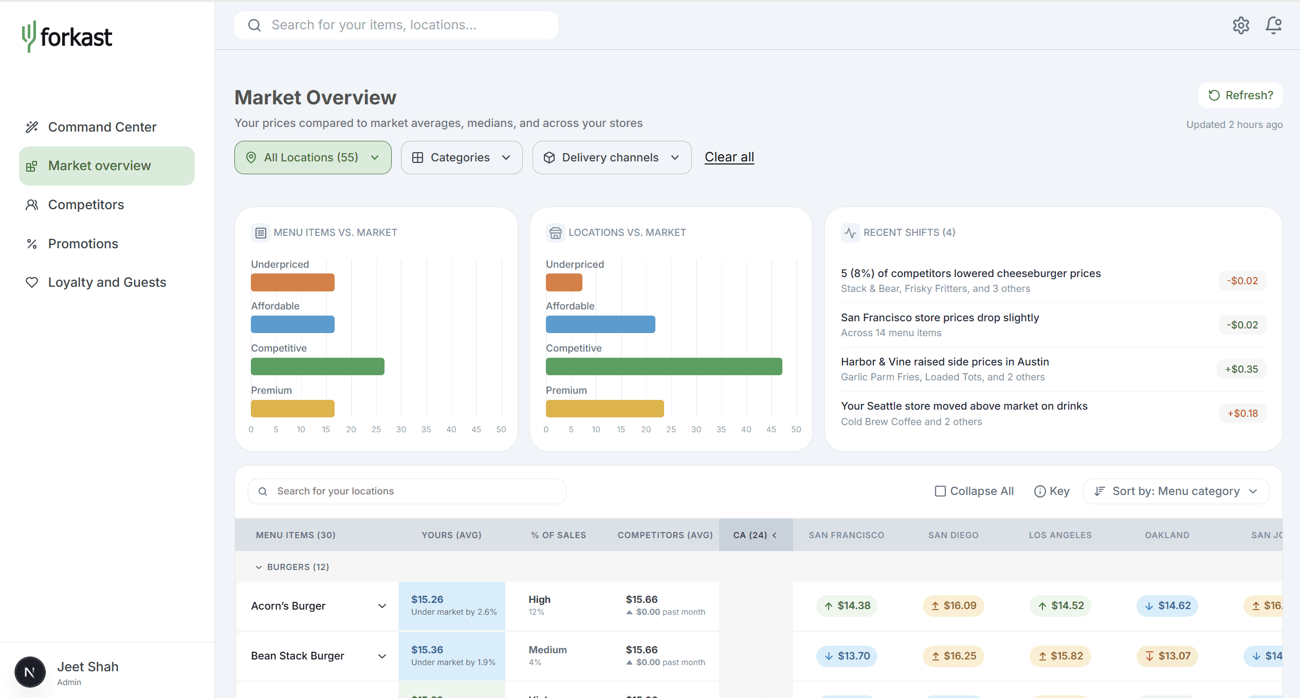
Forkast is a venture capital-backed B2B startup in the restaurant competition and market analysis industry. It's used by hundreds of chains, including Michelin-starred locations like Benares and fast food stops, like Red Robin. Over the course of 8 weeks at Forkast as a Product Design intern, I…

This study focuses on the Market Overview tab. I navigated technical and business constraints to produce a full redesign (check out the constraints section for specifics!)

The Core Issue: The previous dashboard had useful data, but there was so much volume that users struggled to gain insight.
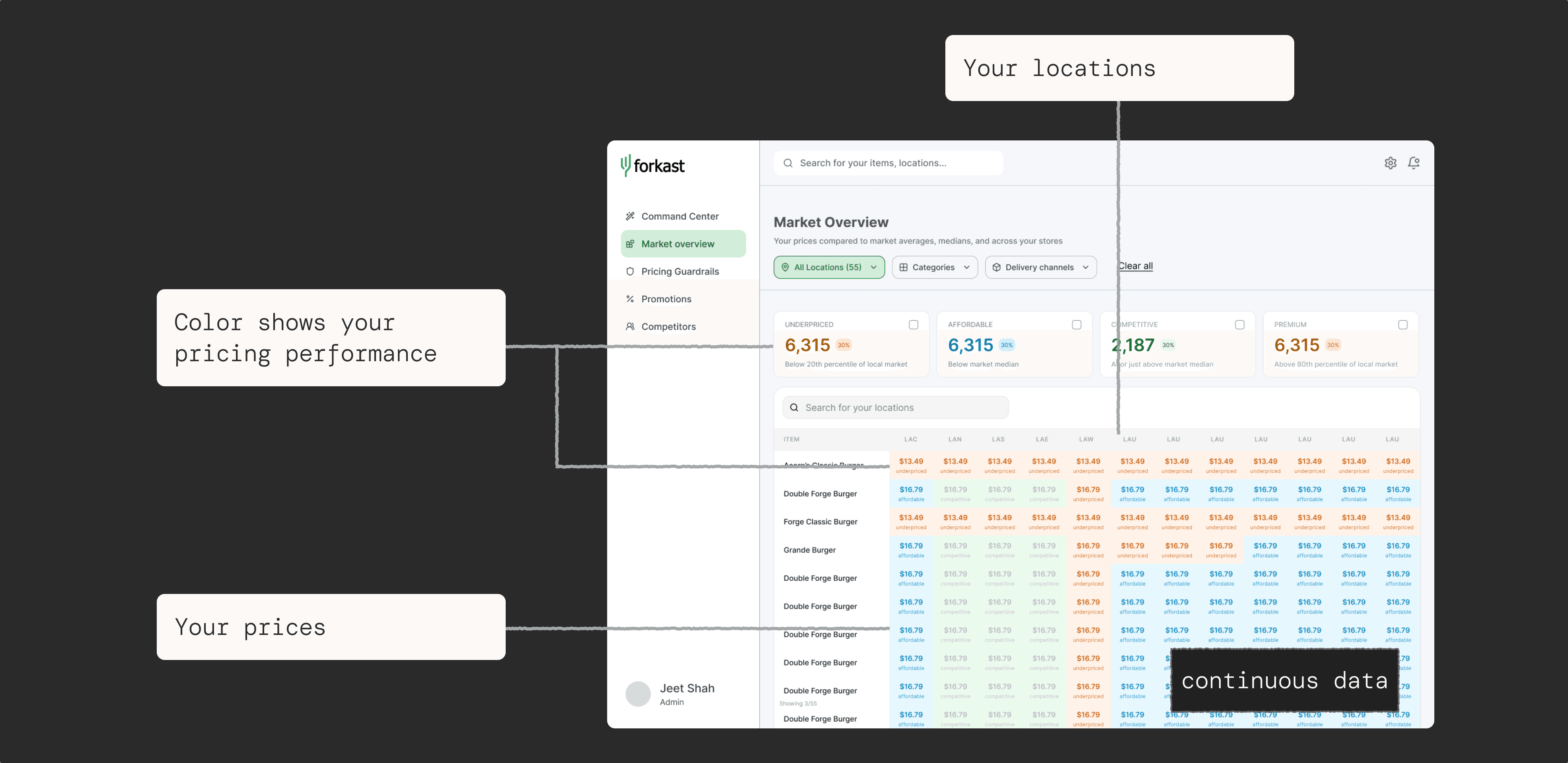
The market changes. The dashboard doesn't show we know that.
Users don’t understand the significance of an item being over/under if they can't connect it to change or themselves.

If users wanted to explore or investigate an item, they'd need to re-filter, search for, locate, and remember information across tabs.
The Market Overview and Pricing Guardrails were two separate tabs, but rooted in one core use case: item pricing comparison.
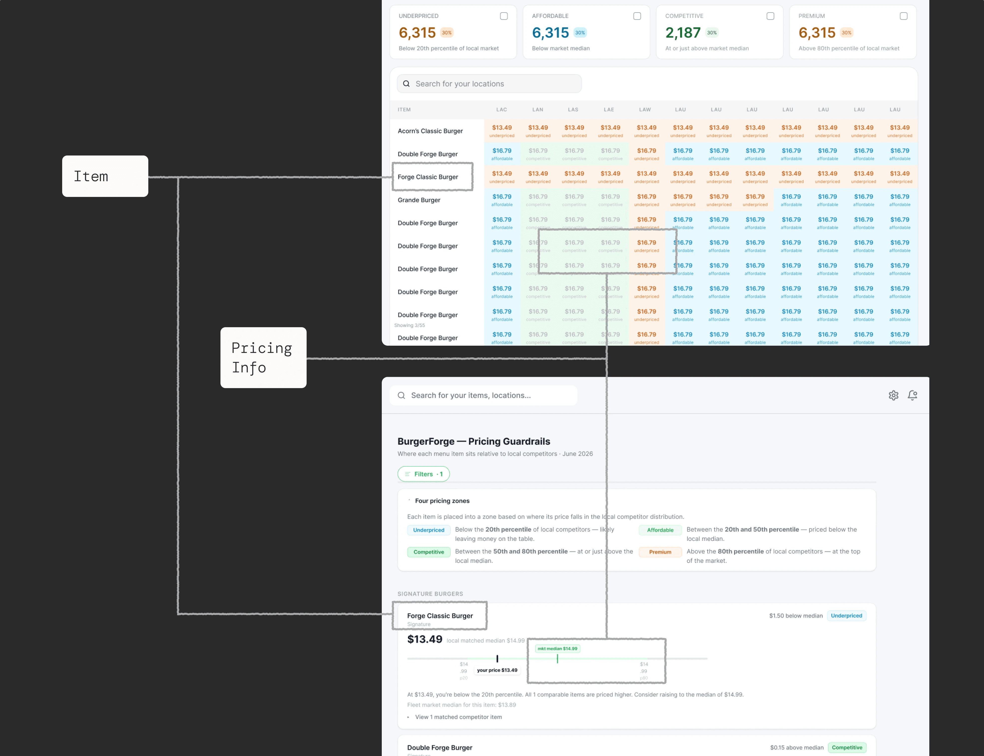


The Solution: Merging Market Overview and Pricing Guardrails into one page, focusing on clarity and insight from data.
Impact
Boosting Efficiency
Users were able to answer questions on both overall item insight and specific details more efficiently with my redesign.
67%
reduction in clicks
44%
faster use
*Based on preliminary A/B testing I conducted amongst 4 users. Will continue to iterate post-ship!
Clarity from numbers
Raising insights to help users answer: how are my items doing? What changed?
High-level insight comes at a glance: through data visualization and summary columns.
Tailored to fit different needs
The amount of insight is controlled by the user.
To allow for flexibility while retaining insight: sort by pricing levels, largest gap from market, etc.
matching human mental models
One item's analytics stay nested together, making comparison lightweight.
Dive deeper and compare items easily. Nudges help you understand and explore other tabs in Forkast when needed.

Before the Design...
How did I get there?
Research + Process
How could I research rapidly + effectively?
Like most startups, we pivot and work as rapidly as possible, pushing smaller features rather than prioritizing perfection
A Structured Design Process…

Data to ground issue
User Research
Benchmark structure with market standard
Insight → Testing → Iteration (on loop)
Final design
…Adapted to Startup Constraints

Informal heuristic evaluation
Research on how restaurants price items
Meetings with team for constraints + assumptions → Iteration (on loop)
Final Design
Insights
Understanding Restaurant Needs
Based on research + discussions, I framed 3 core goals my design should help meet:
1
Restaurants want to understand where their own items' prices are at
2
Restaurants want to compare their prices to the competitors/market
3
The larger the chain, the more they need different levels of specificity in Insights 1 and 2: by item, location, overall, etc.
Ideation and Flows
Information Architecture Rework to Initial Lowfi
Identified similar goals and structures between IA of Pricing Guardrails + Market Overview, checked overarching user goals to merge IA.


Constraints
But what level of insight is feasible?
In my previous projects, I prioritized 100% clarity for user understanding. But over the course of several meetings, I noticed and modified for several shifting constraints.


Can’t directly state “You should increase prices” - it is not possible to state that with statistical/legal confidence
User testing not set up yet in Forkast-- users are less accessible because they're usually company leaders. Instead, I conducted digital research and met with my closest alternatives: the founding team.
Competitor data can be spotty, especially across locations
Pivots
I realized there was a better way to structure my ideation to optimize for time:
Time is of the essence, especially as every member works on everything.

Instead of ideating a many ideal options, I designed based on different categories of assumption
SWE + decision makers in startup space needed less time to critique and decide on the most feasible solution
Prototyping and AI
Prototyping and AI
Figma-first design, with Claude Design used for some exploration! I prototyped the final design in Claude Code for handoff.