Design System
Creating and deploying a web-first design system with 400+ components
roles
Design System
tools
Figma
Claude
team
1 Designer
Me
3 Software Engineers

overview
Design and 0 -> 1 systems thinking
Forkast is a venture capital-backed B2B startup based in the restaurant competition and market analysis industry. Currently, it's used by hundreds of chains, including Michelin-starred locations like Benares and fast food stops, including Red Robin.
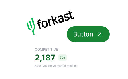
As a product design intern at Forkast, I co-led and executed two major initiatives over 8 weeks: 1) redesigning the dashboard system used for analysis 2) building a design system from the ground up (shown here).




Before Creating...
How did I get there?
Goal Alignment
Forkast's Dashboard and Quantity-focus
I spoke with Forkast's founding team to understand their working goals to then define constraints for myself before ever touching Figma.
1:. Forkast's platform is and will be data-heavy due to business constraints
_
Large restaurant chains have thousands of restaurants.

Forkast's design system needs to be flexible with high information density. I researched industry standards for design systems in this context.
2:. Forkast's scaling rapidly as a business. What does this mean for design?
+
Issue Analysis
Auditing Current Designs
I used an HTML to Figma plugin to pull current components, investigating potential pain points with their current Claude Design-generated system (besides the known uncertainty about consistency).


Breaks in convention: Many components didn't follow standard design conventions, especially for accessibility guidelines. There were dozens of button designs.

Molecular-level issues: Most components were data-driven, but not focused on readability = the dashboards felt like cognitive overload, not actionable insight.


Part of the restructuring of the overall dashboard occurred at this foundational level, in making molecules standardized and easy to read.
Design System Structure
Design System Structure for Scale
Following industry standards, the global library is isolated, while the semantic library is pulled into working design documents.

AI and Iteration
Automating a relinking process to free time for higher-level judgment
a.
The Context: I was exploring overall library structure + building components at the same time to understand how the two needed to interact for max efficiency.
b.
Problem: moving a collection to a new file to publish to a library broke every reference link. I was experimenting with different formats and needed to relink + move often.
c.
Explorations: I first explored several plugins. Relinking by hand would be too slow for steady experimentation and iteration.
d.
Fix: had Claude auto-relink variables as the structure changed
e.
Result: reliable enough to use in workflow, freeing time for me to test, experiment, and publish quickly.

Reflection
Cohesion + Continuity
Designing for cohesion across vastly different elements was an intriguing challenge, as I typically work with existing design systems.
This system is always evolving— as the team expands and continues to design, I expect to continue iterating! Fixing structural errors and continuing to adapt for new features are our likely next steps, and I'm excited to see how we evolve.